Autumn Alert: Pantone Picks the Hot Colors for Fall 2017

Autumn Alert: Pantone Picks the Hot Colors for Fall 2017

If you were put off by Pantone’s official color of 2017, a headache-inducing shade of yellow-green called Greenery, the color specialist’s predictions of the hot colors for fall 2017 are a bit easier to stomach.
In addition to the Color of the Year, Pantone also releases two reports a year on the shades that will be sizzling in the upcoming seasons, based on trends from the twice-yearly New York Fashion Week. So there are no worries that your new wardrobe will clash with your home’s background!
Pantone’s most recent forecast of the colors destined to be popular next fall gives us insight into the colors you’ll want to incorporate into your home in a few months.
Many of the color predictions are appropriate, if not obvious, for the fall season. Autumn Maple, Tawny Port, and Butterum—warm orange, brown-red, and light brown, respectively—are basically the colors of the changing leaves you’d see on a mid-October drive through New England. Nothing groundbreaking about that!
Nevertheless, autumn does seem like the best time of year to embrace rich, earthy colors in your home.
“This particular collection captures both the enveloping richness and the awakening crispness of the season. They’re cozy but refreshing and anything but boring,” says Margaret Schaffer, an interior decorator and home staging expert in Boca Raton, FL.
The other top colors that are not stereotypically autumnal include Ballet Slipper (a pale pink), Marina (a cornflower blue), and Golden Lime, a shade that seems like Greenery’s darker, more subdued sister. All are “earthy tones with a twist,” as described by Pantone in a statement.
Below are six shades from Pantone’s fall 2017 line that could easily be incorporated into your home, whether as a full painted wall or an accent pillow.
Autumn Maple
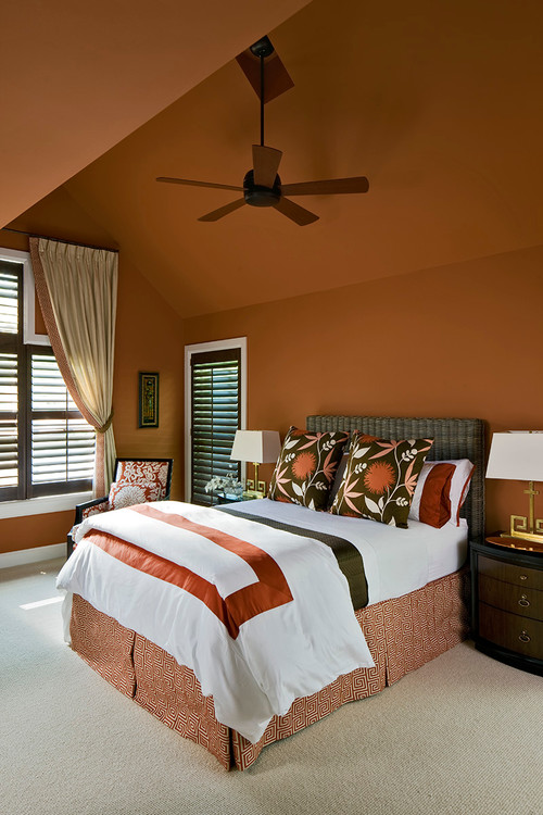
Although the name would suggest this color is tailor-made for fall, it’s really a warm shade of orange-brown that many regard as more of a neutral.
“If you want to use such a saturated color to cover an entire space, it’s best done in a large room with numerous windows and high ceilings, where there’s a lot of space and light,” says Leo Biyevetskiy, editor of remodelingcalculator.com.
———
Golden Lime
Interior designer Lori Miller of New York calls Golden Lime a “go-to” wall color when combined with floral accents and muted fabrics. But if the thought of staring at a full wall of yellow-green is too much to handle, start small by introducing it as part of a textile pattern or artwork so it doesn’t seem overwhelming, Schaffer says.

Photo by LDa Architecture & Interiors
———
Butterum
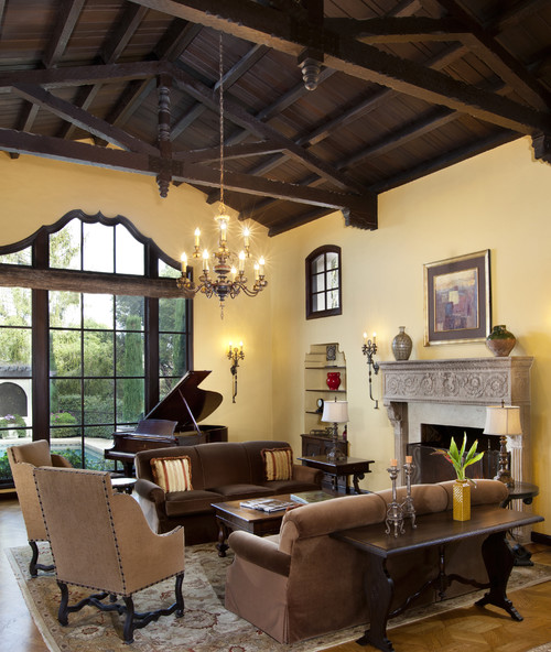
For those of you who love the rustic vibe of a yellow wall but want to switch it up with something that feels more current, give Butterum a try.
“This is the only color in the lineup that I can see being used to cover walls of an entire room,” Biyevetskiy says. “It would work well in a bedroom, living room, kitchen, dining room … really anywhere.”

Photo by Bernard Andre Photography – A living room in a darker shade of yellow feels cozy.
———
Tawny Port
Bold red is a difficult color to decorate with, but Tawny Port is a deep, tasteful variant that can add a sophisticated edge to a room as an accent wall or main color.
“It would work well as an accent color in a dining room, living room, or large hallway,” Biyevetskiy says.
 Photo by Cynthia Lynn Photography – Don’t rule out decorating with red; just use a darker shade like Tawny Port.
———
Ballet Slipper
Yes, pale pink feels at home in a young child’s room, but there’s so much more you can do with this shade. To capture that warm feeling in your home this fall, try pillows or window shades in this rosy hue.
 Photo by Santos Rosado – Install light pink curtains for a light and airy feel during the darker months.
———
Marina
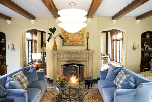
Pantone calls this shade of blue “the only true cool color in the fall palette,” but design is all about balance. In a room filled with otherwise warm tones of yellows and browns, use Marina to achieve harmony and keep the overall composition fresh and engaging.
 Photo by Joni Spear Interior Design – Twin sofas in Pantone Marine anchor a living room dominated by warm neutral shades.
The post Autumn Alert: Pantone Picks the Hot Colors for Fall 2017 appeared first on Real Estate News & Advice | realtor.com®.
Source: Real Estate News and Advice – realtor.com » Real Estate News

